In 2015, we took a new look at our website and decided it was time to make some bold changes. Likewise we decided it was time to freshen up our image with some new branding elements.
The 2015 version of the Northern Edge Algonquin logo was designed by Shane Fleming at Spotvin Creative in Windsor, Ontario. Shane’s team did a terrific job bringing the aspirational nature of our new logo to life along with a half-dozen sub-brands that have their own aspirational messages.
We thought it would be fun to provide a little insight into the logo. If you’ve ever been to the Edge the imagery will seem familiar, particularly if you’ve ever traveled on on overnight canoe trip in Algonquin Park with us.
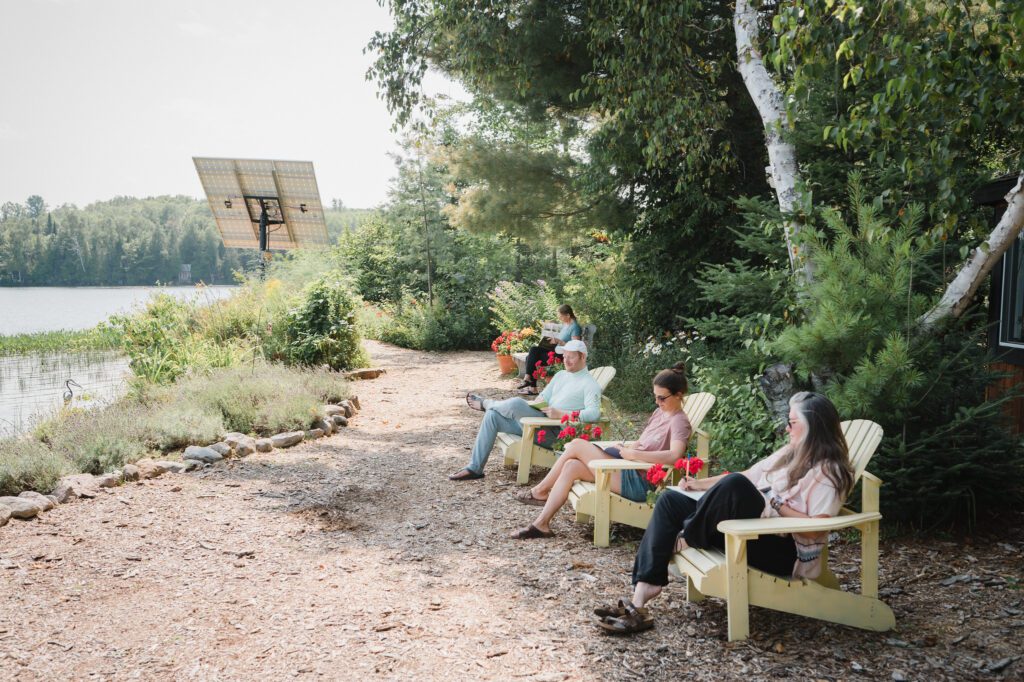
Octagons are a familiar site at the Edge, whether in the shape of the yoga room or cafe in Points North, the compasses crafted by Gregor Waters in the lobby of Points North, dining room in the mainhouse or the stonework at Highlander House, the icons on many buildings, the cedar sauna. The compass points are also familiar imagery to anyone who has used a map and compass (like some of our guides) or executive teams navigating a team building initiative.
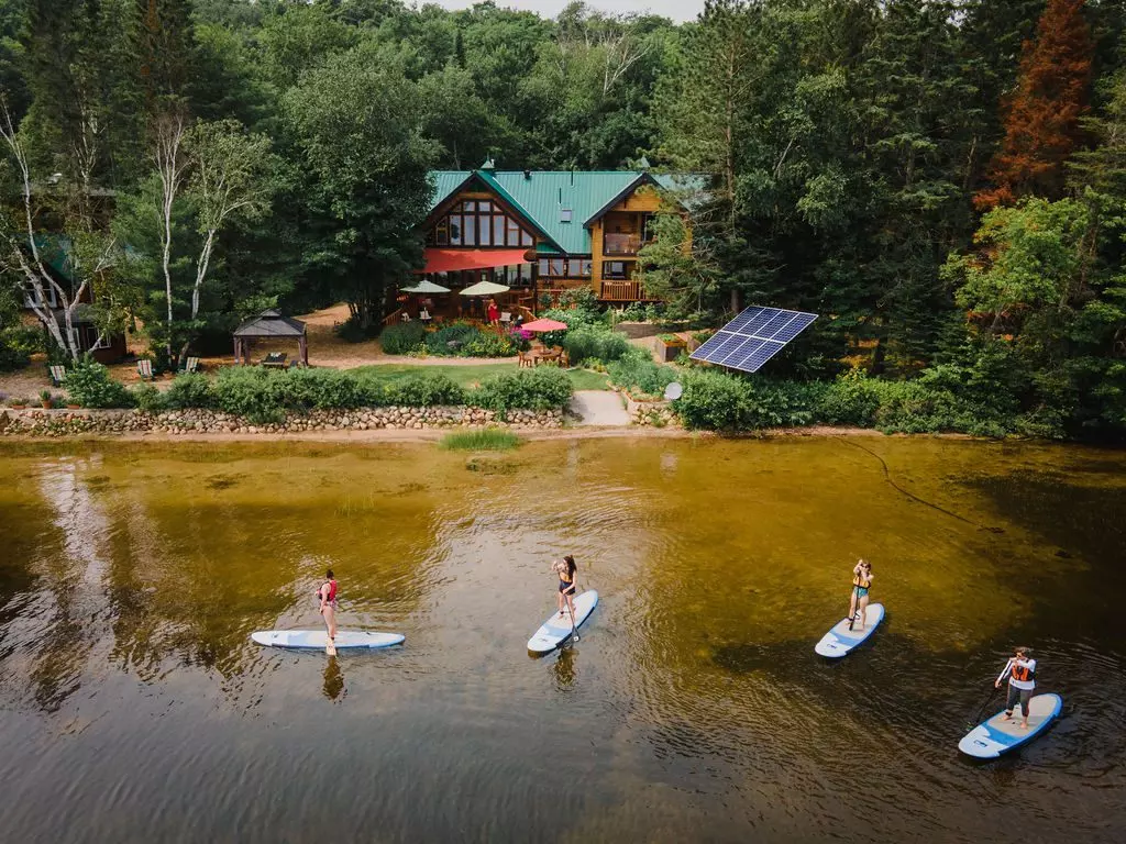
The river, is the Amable du Fond River, a beautiful winding river that takes paddlers east towards North Tea Lake and links to over 8000 km of Algonquin parkland. The trees on the river are black spruce. They are the most dominant trees near the river. Tamarack are also plentiful. Further from the river, maples, birch, balsam fir, hemlock and pine are found.
The sun rises in the east and it’s looming presence is often announced by the morning stars Mercury or Venus which rise first. The star high in the logo is aspirational and helps each of us keep our focus on delivering transformational experiences at our Algonquin Park home.
You've been signed up to receive news, updates, stories, and special offers from The Edge!